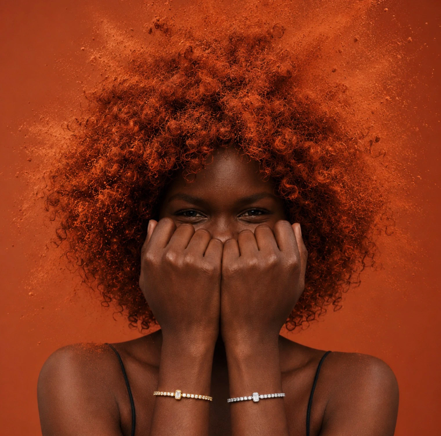
DIRECTION 01 — EVERYDAY CONNECTION
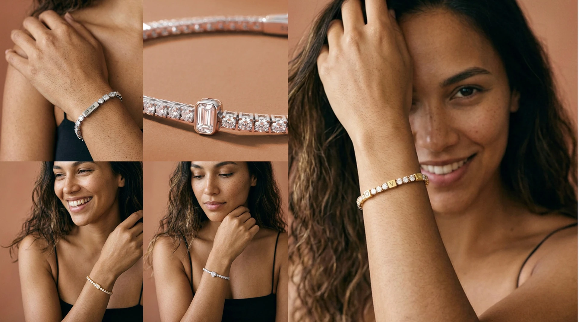
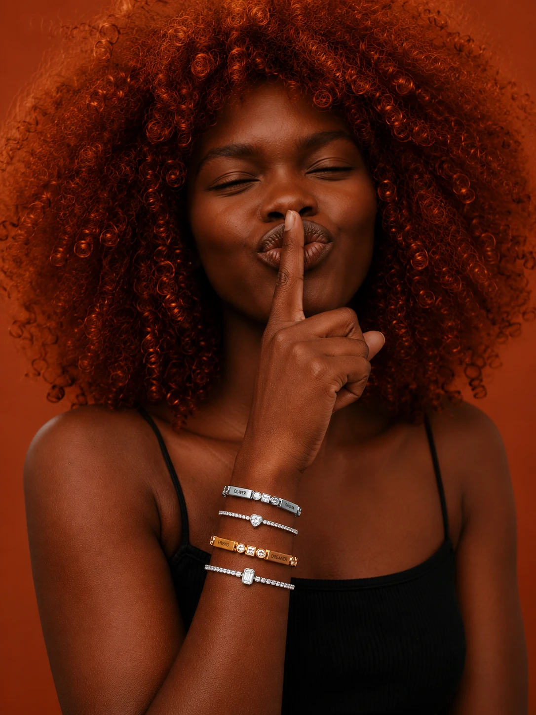
An intimate editorial approach built around soft light, natural expressions and warm terracotta tones.
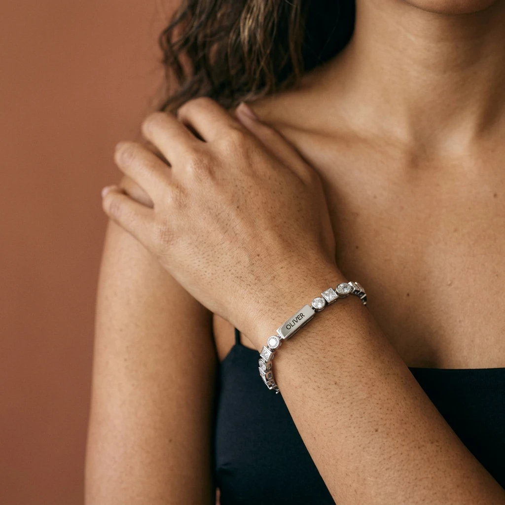
The imagery places the jewelry within personal, everyday moments, with gestures that bring attention to the wrist and hand.
THE BRIEF
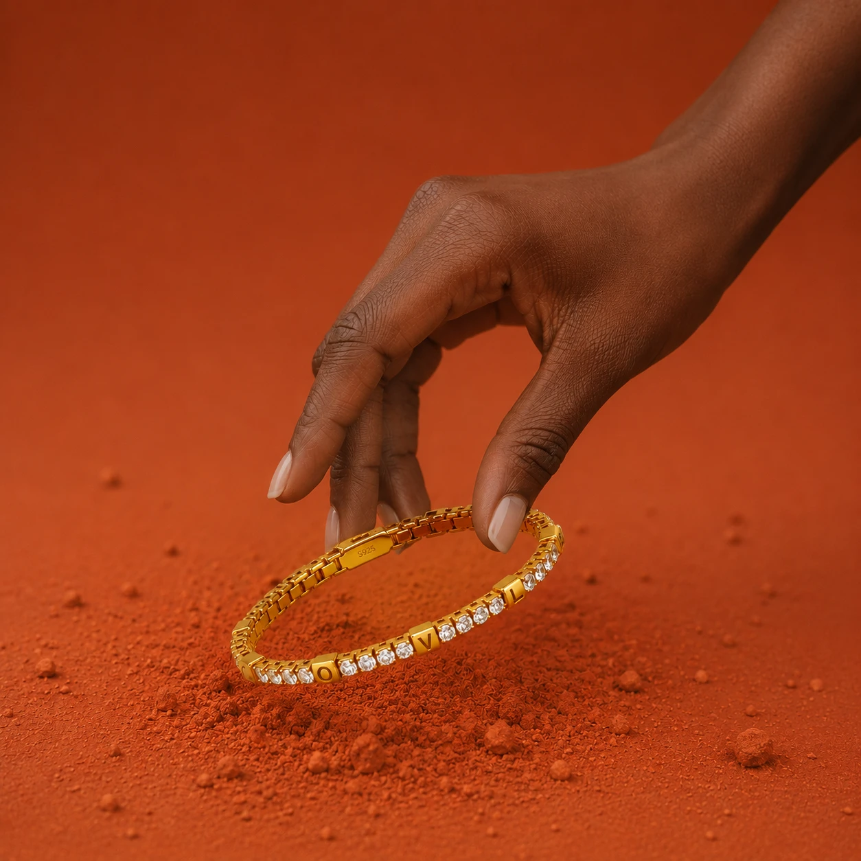
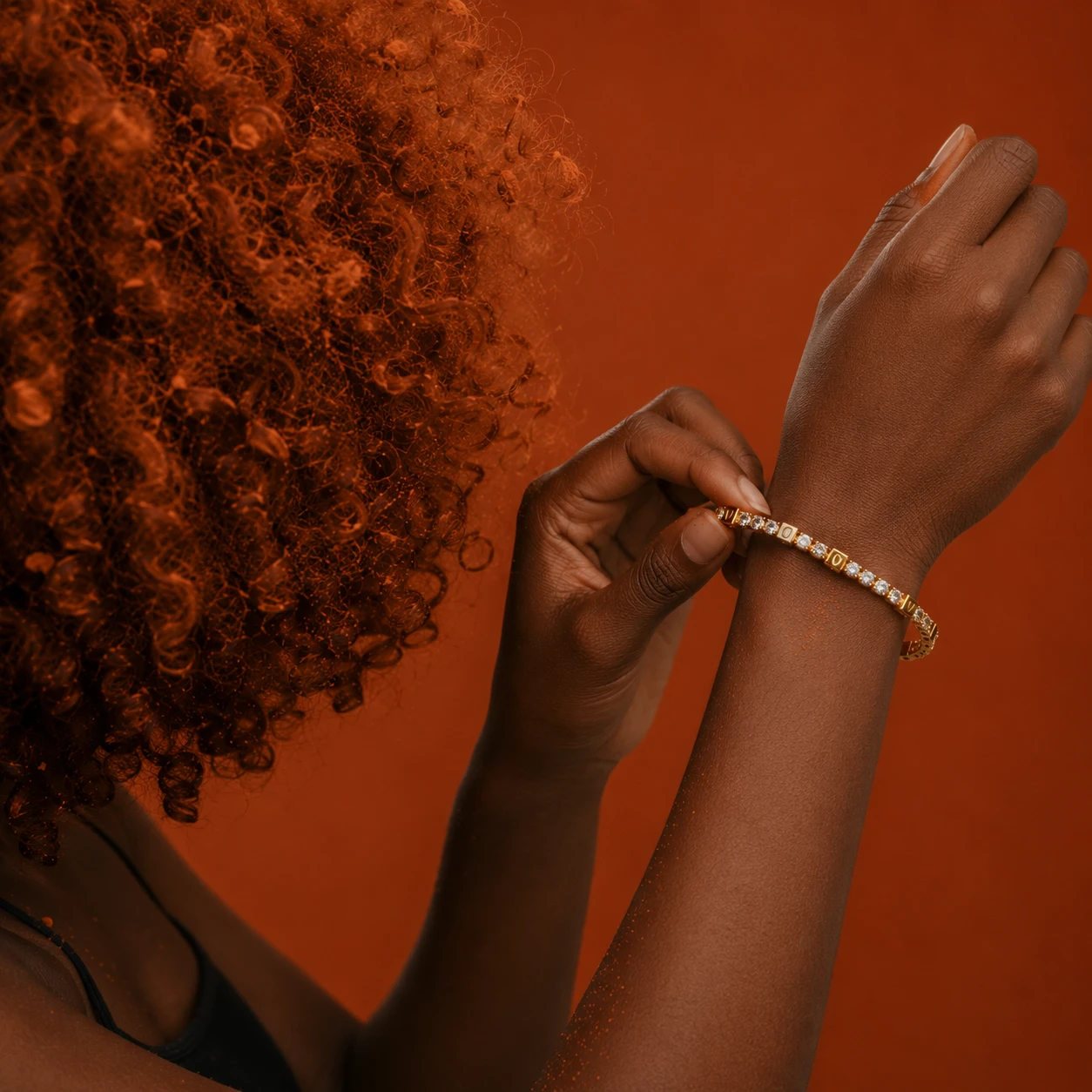
Develop a recognizable visual language for the Tennis Collection within Oak & Luna’s existing brand identity.
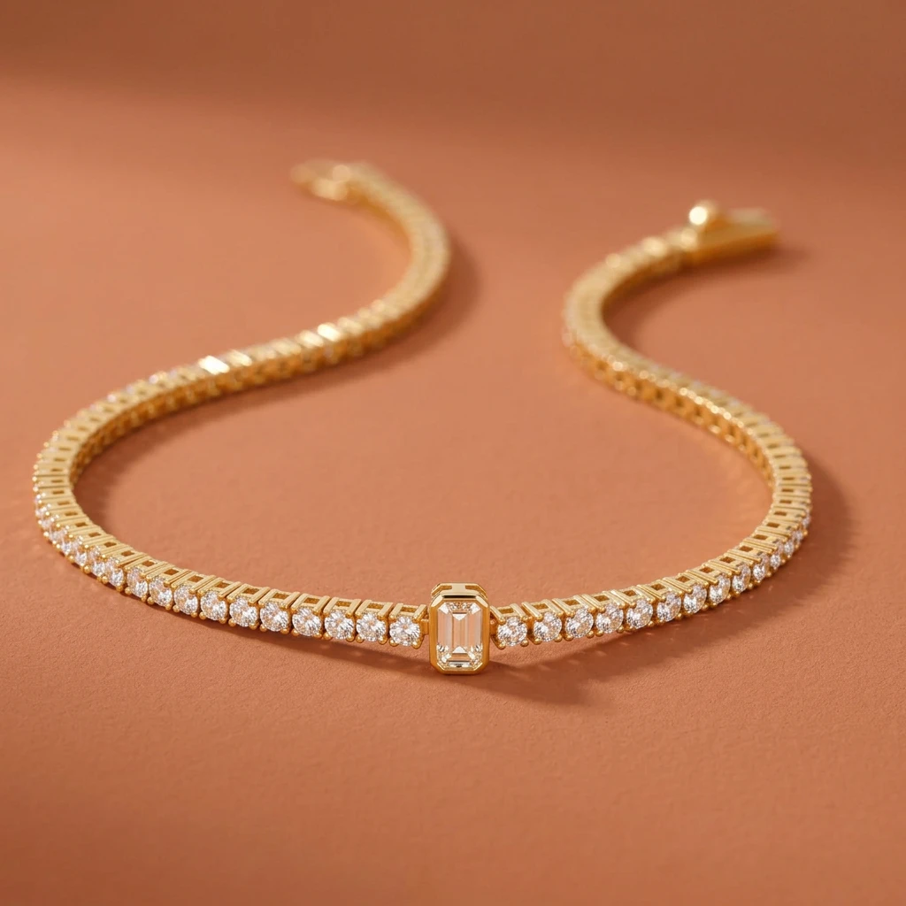
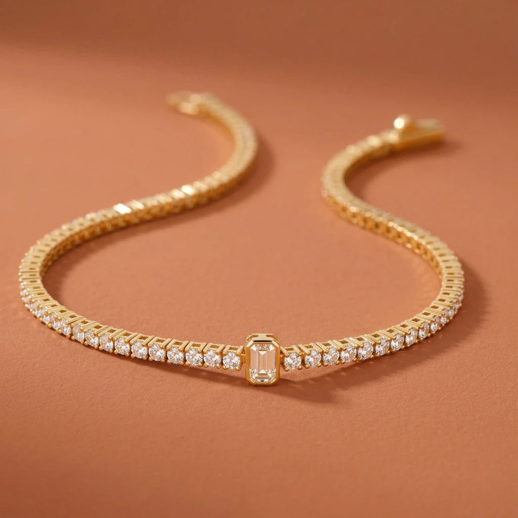
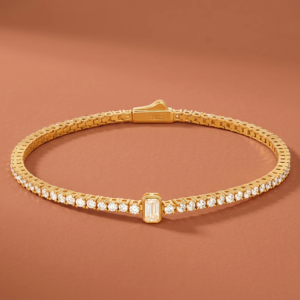
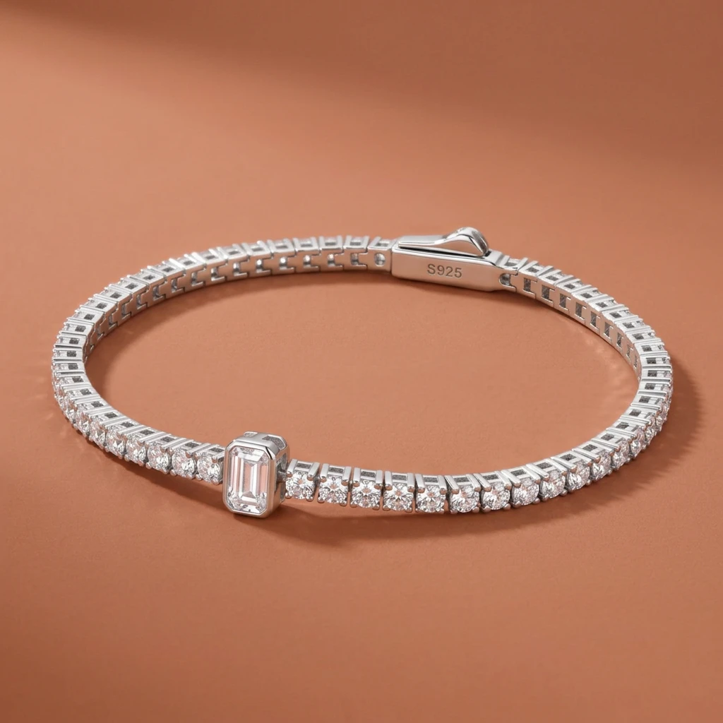
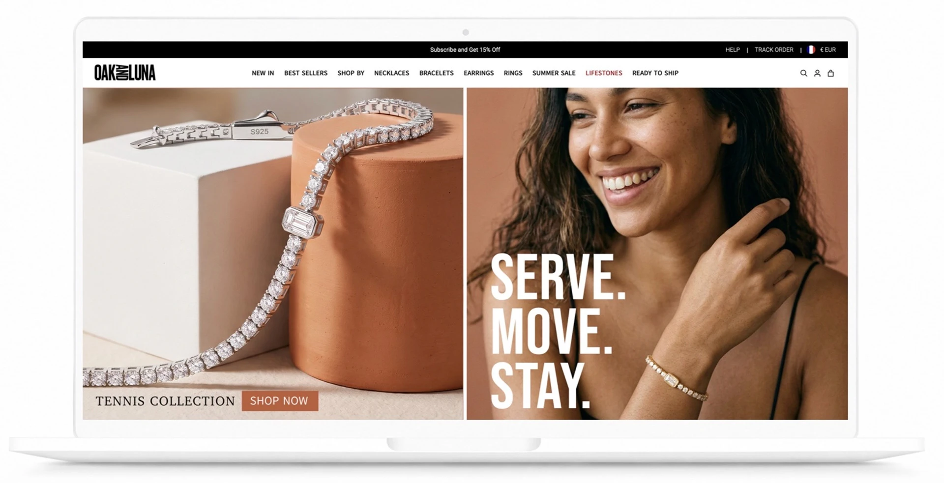
The collection needed a premium, emotional and adaptable campaign direction, supported by visual guidelines, AI-generated imagery and applications for the homepage, newsletter and Instagram Stories.
THE CONCEPT
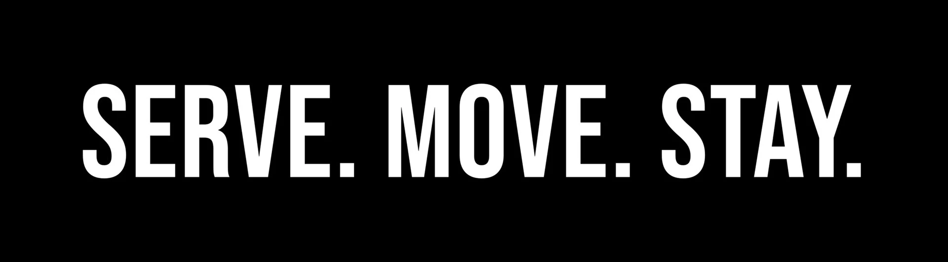
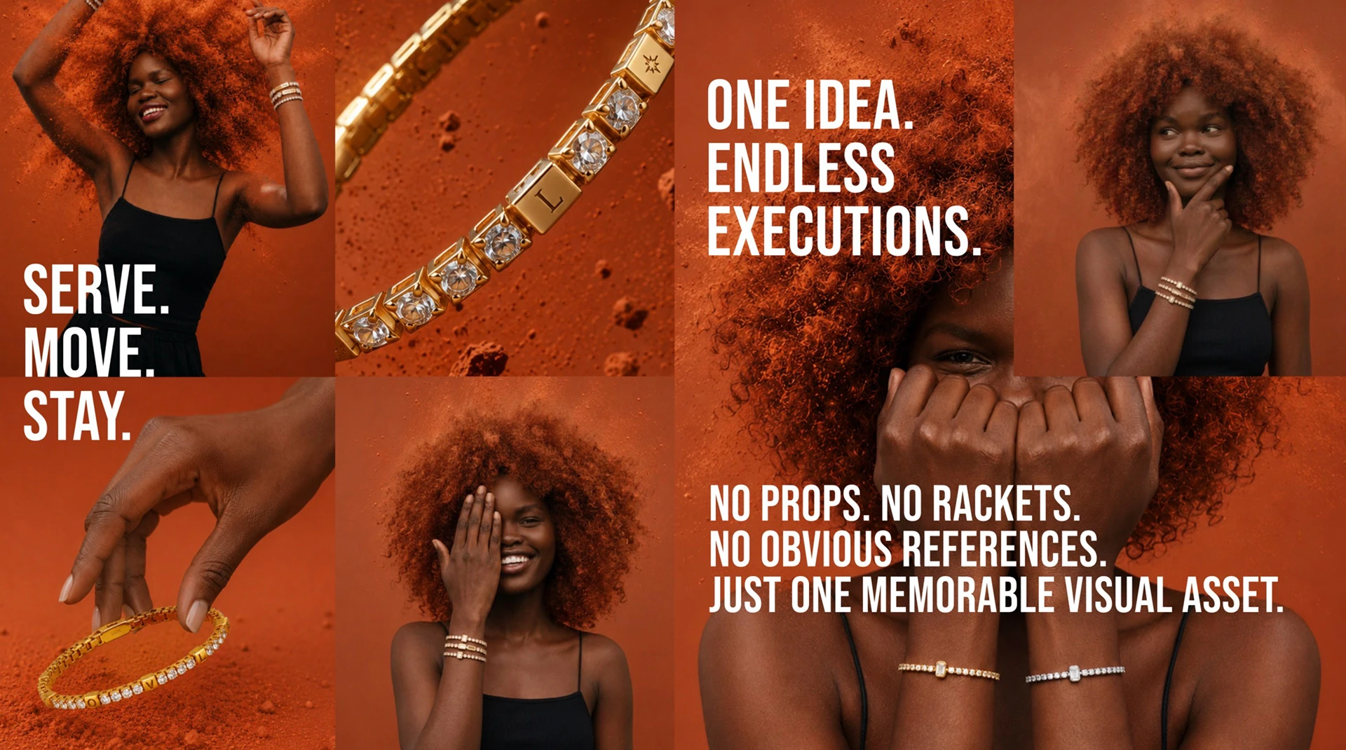
SERVE. MOVE. STAY.
Inspired by the tennis bracelet’s connection to movement, I built the campaign around a simple idea: a piece that moves with you and becomes part of your story.
SERVE
The first move. Confidence, discovery and the beginning of a connection.
The first move. Confidence, discovery and the beginning of a connection.
MOVE
Life in motion. Everyday moments, individuality and personal expression.
Life in motion. Everyday moments, individuality and personal expression.
STAY
Lasting meaning. Emotional attachment and a piece you make your own.
Lasting meaning. Emotional attachment and a piece you make your own.
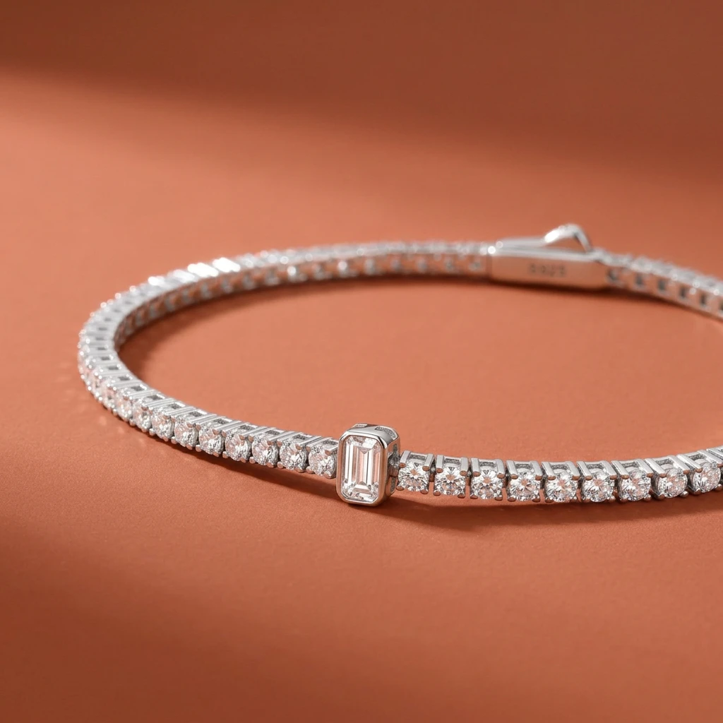
VISUAL EXPLORATIONS
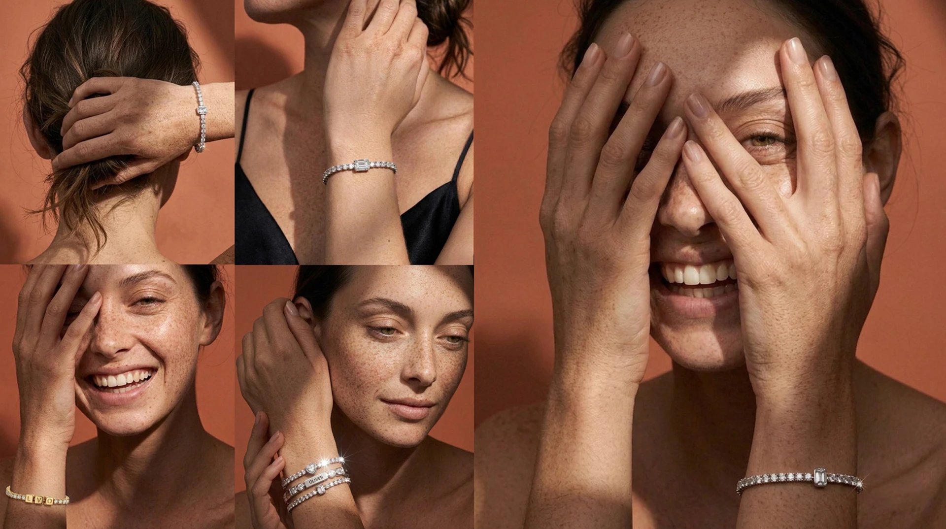
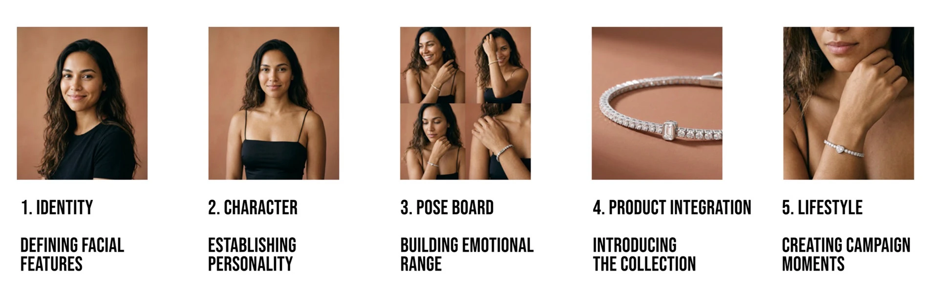
I explored different characters, gestures and compositions to define the collection’s emotional tone.
The selection focused on the relationship between expression, hands and jewelry, and on how each image could work within the wider campaign.
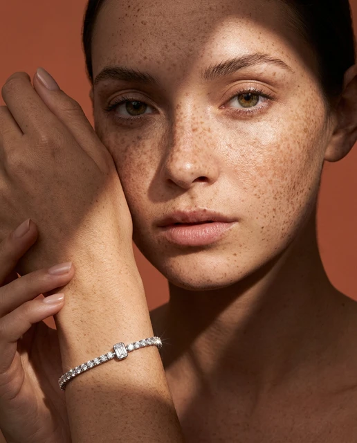
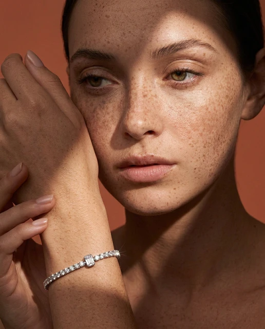
DIRECTION 01 — EVERYDAY CONNECTION
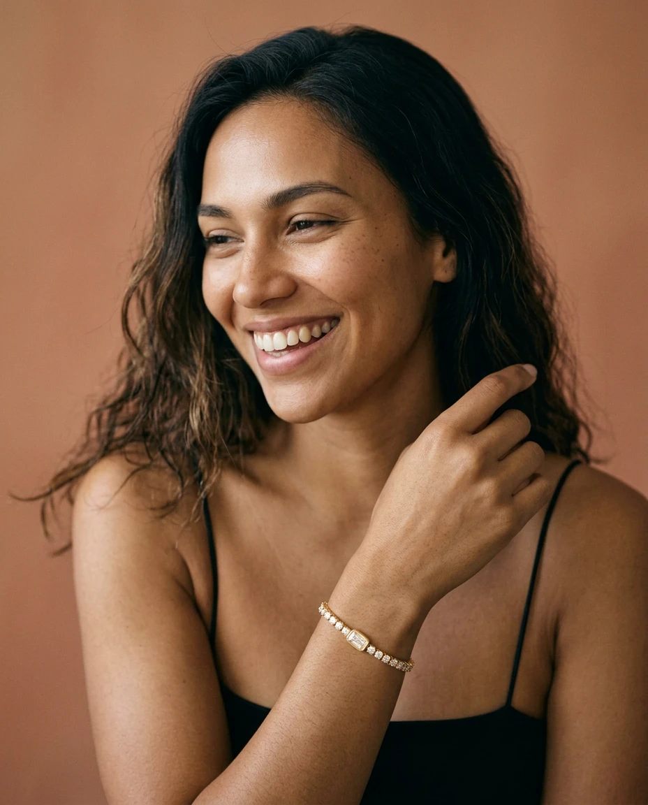
An intimate editorial approach built around soft light, natural expressions and warm terracotta tones.
The imagery places the jewelry within personal, everyday moments, with gestures that bring attention to the wrist and hand.
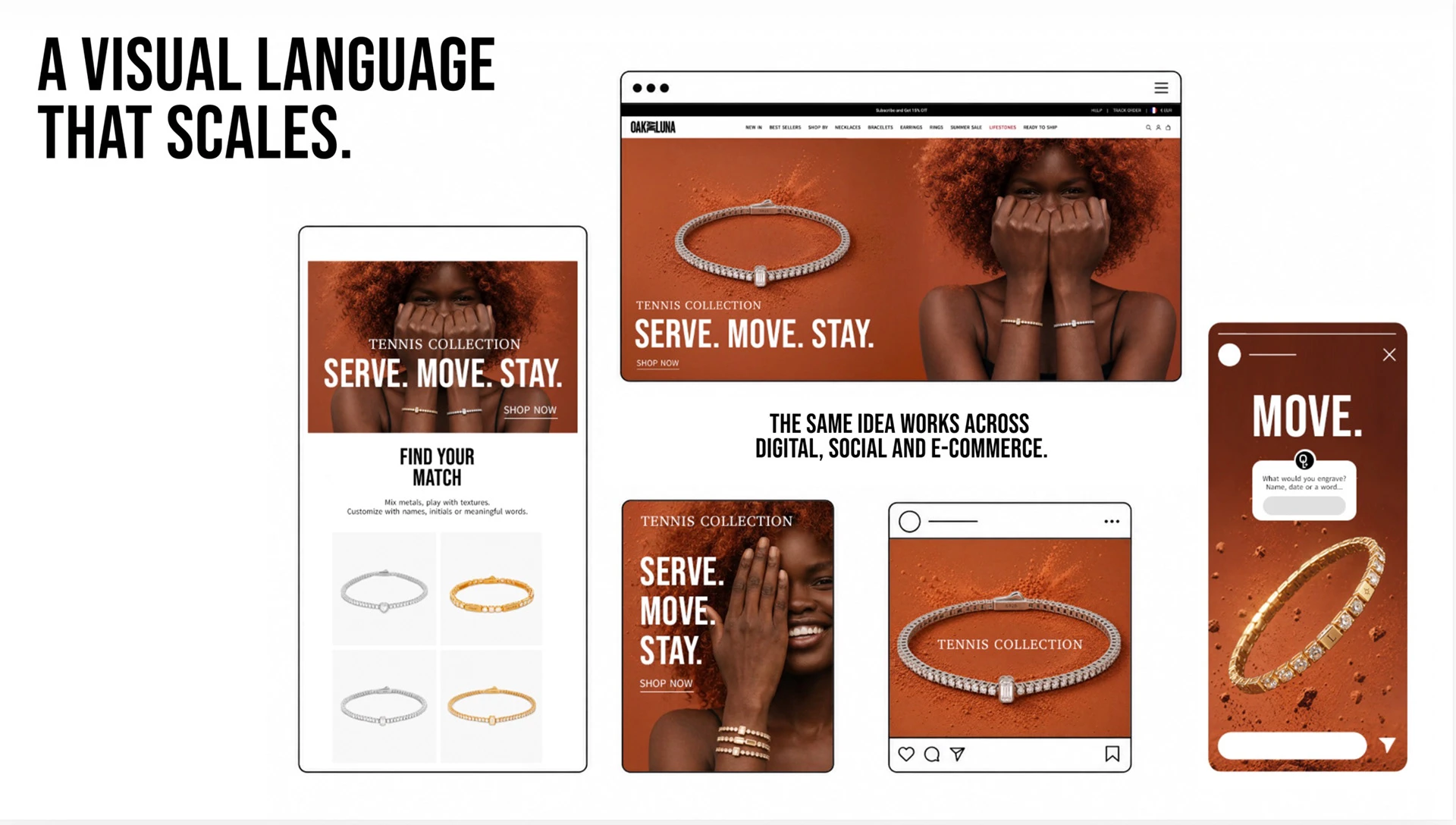
A CONNECTED DIGITAL EXPERIENCE
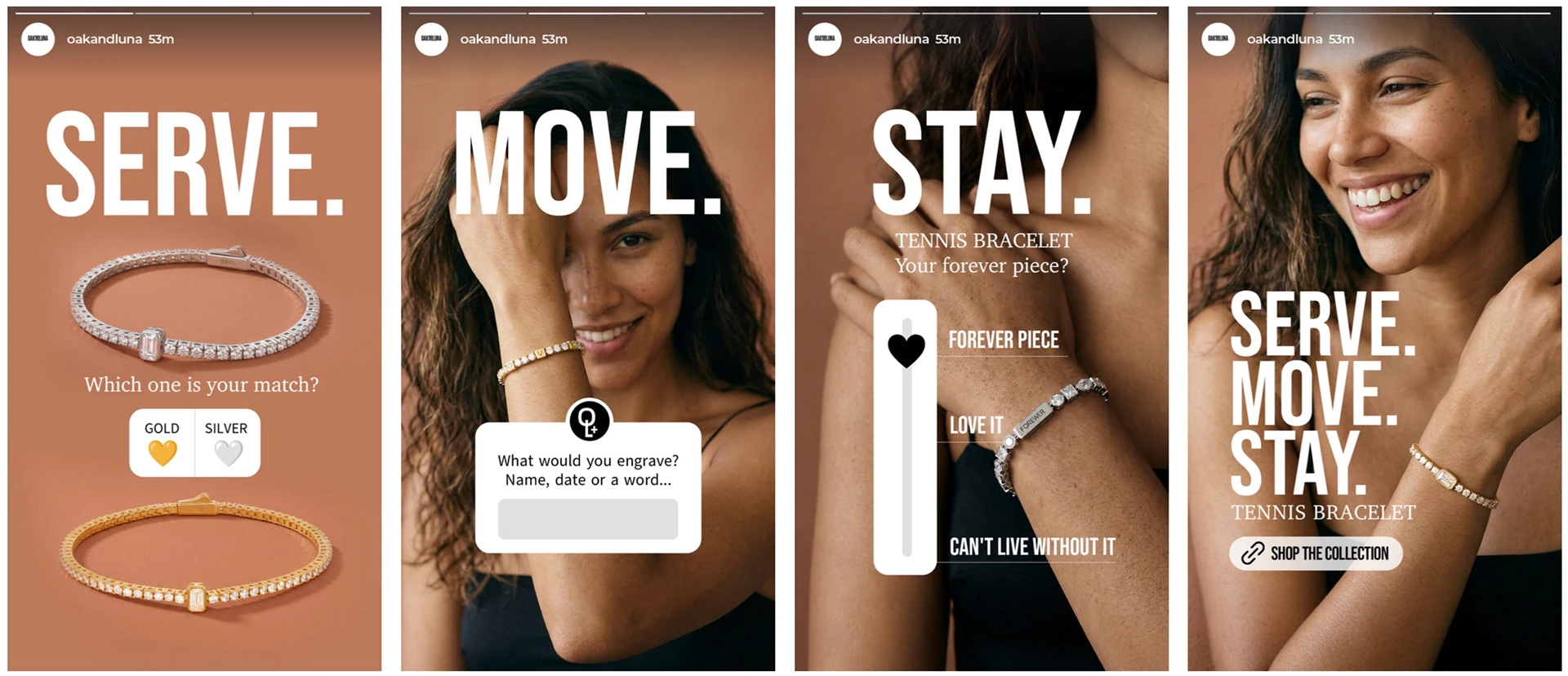
The concept extends across the homepage, newsletter and Instagram Stories through a shared image direction, typography and campaign voice.
The Stories sequence invites people to choose a metal, imagine an engraving and express a personal connection before exploring the collection.
Each interaction develops the meaning of SERVE. MOVE. STAY.
DIRECTION 02 — MOVEMENT BECOMES TEXTURE
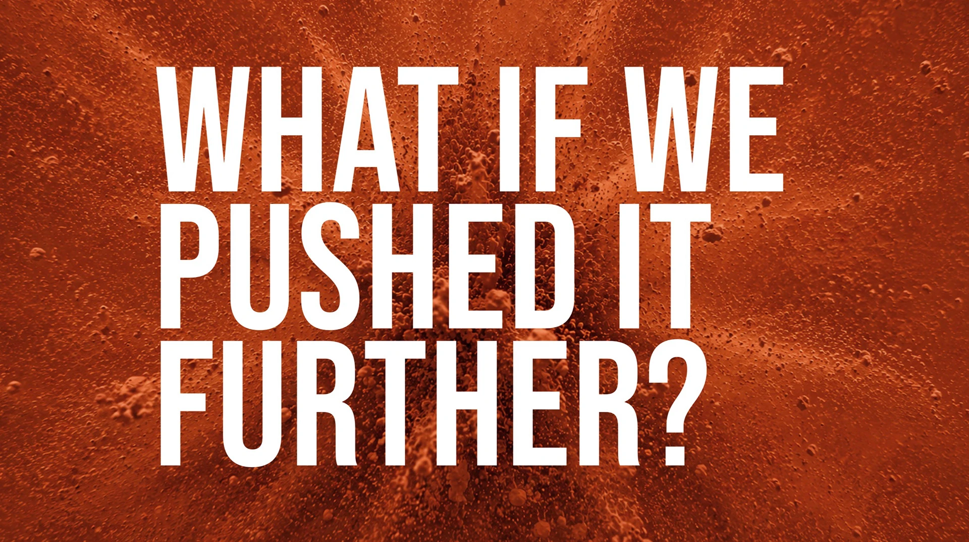
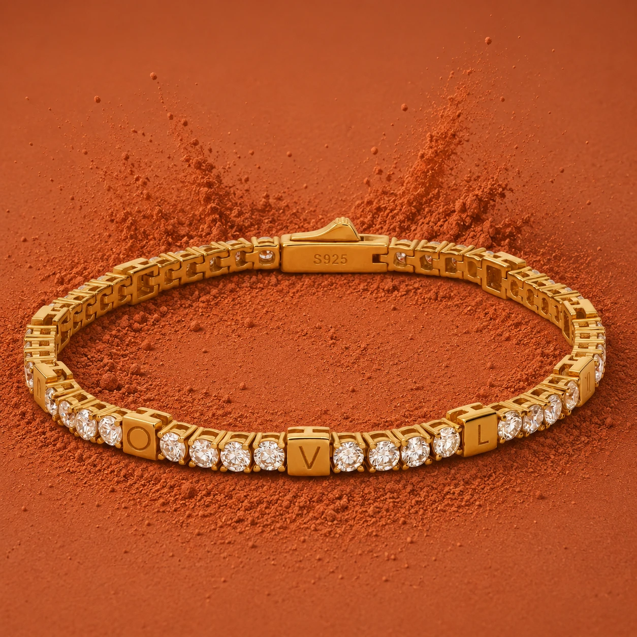
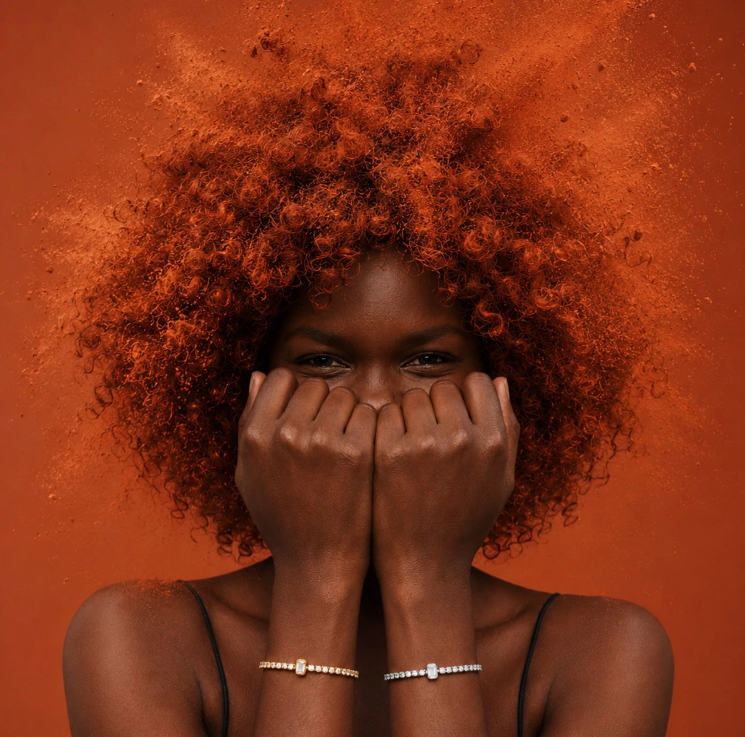
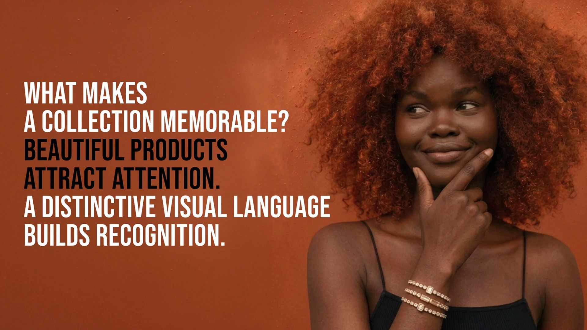
The second direction expresses the tennis connection through colour, texture and movement. Terracotta court surfaces and sculptural curls create a visual relationship between the character and the environment. Dynamic gestures bring energy, while jewelry close-ups anchor the campaign in the product. The same concept takes on a bolder, more expressive visual form.
ONE COLLECTION. TWO CREATIVE DIRECTIONS.
From supplied product photography to a complete campaign, this project brings together concept, copywriting, AI art direction and design. Two visual directions explore the same idea: jewelry that moves with you and becomes part of your story.
SERVE. MOVE. STAY.
Creative concept, copywriting, art direction, AI image development and graphic design.
Campaign imagery created using AI, with supplied photographs of existing products as references. Existing brand identity and supplied product assets belong to Oak & Luna.
Thank you for viewing.